-
Making GIFs in My Free Time
We’ll see if this GIF stays animated once I put it on the web. It might depend on your browser and the whims of ImageMagick. It’s animated on Facebook, which is something.
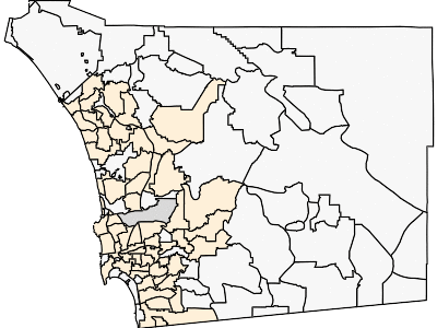
This GIF should be showing you the spread of COVID-19 through San Diego County, based on the total denisity of people infected (number of total cases per 10,000 population) by ZIP code. Orange-based colors are for ZIP codes with more than 10,000 people and more than 5 cases. Other ZIP codes are in gray-scale. Darker colors means a greater density of cases. Yes, this is total cases (not new cases). Yes, I might work on the GIF for new cases at some point, but this GIF was already kind of annoying to make.
Instead of devoting my recreational screen time to writing blog posts or watching TV or browsing knitting patterns that I might never make, I have been putting the infrastructure in place to make GIFs like the one I linked above. (But if it is not animating itself, I hope that the next version of it will stay animated.)
You might think: “Take some images, toss them in a directory, and then run ImageMagick over them all to get a GIF.” If you don’t know ImageMagick, it is the best ever command line tool for making images do things without having to open up some GUI-based software and click on things. You can script all sorts of amazing things with images.
Let me tell you about what it has taken me to create the images. I guess we’ll work backwards.
Each image comes from an SVG (scalable vector graphics file) that is created by the d3 data visualization library. For those outside of this field, this is a JavaScript library meant for displaying data on the web. My data is a tangled JSON object, and the array of ZIP code data holds an array of total number of cases in the ZIP code, by date. I can tell d3 to alter the fill color for each ZIP code based on the number of cases. Easy? Well, that is fine if you are showing the map on a web page (which d3 was designed for) and having the map update itself when you click a button on something, but I want to have this all work on in the background in the middle of the night and have a new GIF waiting for me each morning. We’re not there yet. I still need to meddle with the process in order to produce the GIF automatically.
Enter nodejs, which will let me run JavaScript on the server instead of in the browser. Also I needed a virtual DOM because there is no web page displaying the map when it is all running in the mind of the server, so I need to tell JavaScript that it should pretend that there is a web page so it would know where to put things. Also, JavaScript has some sort of weird stuff going on about things running synchronously vs. asynchronously, so I couldn’t just put my mapping function in a for loop and loop over all of the possible dates. I guess I could, but I didn’t really want to use Promises, which is how JavaScript deals with such things.
Can’t loop over all the dates inside JavaScript? Rewrote the JavaScript script to take a command line argument and then wrote a bash script to call the JavaScript via node at the command line. Each call to the JavaScript script writes out a frame. OK, now we have a way to make all the images. And then I can have the bash script call ImageMagick over the directory full of images and then move the finished GIF to the right place so that it can be served by the webserver.
Where does my JavaScript mapping script get the data from? It reads in a JSON file from disk. Where does this JSON file come from? The bash script tells a PHP script to make it. How does the PHP script make the JSON data? Well, it has a connection to a MySQL database that contains the information that it needs in order to build the JSON file. Eventually all the data came from the County’s data service.
The PHP script is a bit more than I’ve mentioned above. What it does is it checks the MySQL database to find the timestamp of the most recent update that it has from the County. If that timestamp is long enough ago that the County should have published more data by now, it makes an API call (this is a very annoying API, btw) to get the new data and processes it to save in the database. The PHP script can use all of the data (both new and old) in order to create the JSON object. Note that the County’s API limits the amount of information that it will send you in a single call so you can’t get all of the data over all time by sending one query to the API. You either need to do a bunch of calls (SLOW!) and string them all together, or else you need to cache the older data so that you only need to get a little bit from the County. I went with caching because this data is only updated once a day, so it seems silly to keep looking for it in The Cloud if you know that there won’t be any new data for many hours.
(Since I’m doing all this on a server that a friend lent me, not some sort of professional hosting, I had to install the webserver, the database server, etc. and configure them all to play nice together.)
I should clarify here, the County API provides the case count per day per ZIP code. It doesn’t tell me anything about the ZIP code boundaries. These I got from a shapefile from a different part of the County’s data stores. Did you know that professional geographers have all sorts of ways to encode locations on the surface of the planet? Those of us outside of the geography biz probably use latitude and logitude for this purpose. I know that the d3 mapping functions use latitude and longitude. There are several geographic coordinate systems that use latitude and longitude. The County’s ZIP code shapefile does not use one of them. Not only did I need to convert the shapefile to a data format that could be read in by d3 in JavaScript, but I also needed to convert the coordinate system to WGS84. I tossed this geographic information into a different table in my database, and whenever I get new data about COVID-19 case counts in the various ZIP codes in the County, I can join the data up on the ZIP code and then write out a JSON object that contains everything that my script needs to make the map: Boundaries of the ZIP code, population of the ZIP code (found in a different data source published by the County), and an array of the total number of COVID-19 cases in that ZIP code (since the County started publishing this).
Now I just need to put the finishing touches on the bash script and set it to run on a cron so that I can have a fresh GIF each morning. And this is why I have not been blogging. Once the code is nice enough that I’m not embarrassed by it, I might make the GitHub repo public so that other people can make their own GIFs in a similar way.
-
The Worst Documentary Ever
Just to be clear, this is not a film that already exists. This is my terrible pitch for something that would be a terrible idea. Also that no one would allow to happen for so very many reasons.
There are a lot of people who do research on Kids On The Internet, so the fact that this idea would never happen is not going to keep you from hearing about kids on the internet. Someone I know just got a grant to study something along these lines. Tweens on the internet during social distancing? Something like that.
Roughly half a million accounts have been created on our site, and a lot of them belong to people who are currently kids on the internet. I don’t know how many of these accounts are still active or how many of them are still kids, but, oh my goodness, there are a lot of kids spending a lot of time on our site. Now, don’t get me wrong, there are also a lot of adults who spend too much time on our site as well. The thing about our site is that you kind of assume that everyone is a 13-year-old boy, but you can’t really know that.
So here is the pitch: pick some number of sub-groups of our users and watch their interactions on our site and then also meet them in real life. I think that this sort of story-telling works best with an odd number of subjects, so to make this imaginary pitch be feature-length, I’m going to say that we should look at five groups.
We’d start with a group that is somewhat unsurprising. A bunch of kids who post about their math contest goals and aspirations. Kids at the high school level. The sort of kids who aspire to be the sort of kids who would be featured in a film like Hard Problems. Send a crew to the kids’ houses, look at their wide array of math books. See the kids put together their schedules of how much time that they’ll spend studying each day. Talk to the parents about what they think of the kids’ math contest goals. Have the kids read some of their posts out loud. There are certain types of posts that they make all the time: “This Is My Math Contest Journey” or “Tell Me How Many Hours I Should Study Which Topics In Order To Win” or “How Many Points Do I Need To Score To Be Guaranteed Admission To Harvard.” As counter-point to this part of the narrative, we’d also talk to some of the long-term moderators who tell each new crop of students that there is not a fixed recipe to become a math contest champion. You should sit back and enjoy the problems. This is what everyone expects when it comes to the journey of math olympians.
As is true of the genre, we should probably skip around back and forth among the groups that we are documenting. We shouldn’t just have the Math Contest Strivers taking up the entire first fifth of my imaginary film.
I guess from here we would move on to a particular social group. I’m not going to mention their group by name because they try to stay under the radar – not in a troublemaking way, just in a minding their own business kind of way. A lot of the students from The Group are into math contests and take classes on our site. But they also put a lot of time and effort into maintaining their group. The Group is run via a system of private forums (students can only join if invited + approved by someone who runs the private forum, kind of like a secret Facebook group). They have a system of elections in order to select moderators and approve new members. Just about everything that I’ve seen on The Group has been pretty wholesome. There are a lot of homeschool students in The Group. Members of The Group has arranged – with their parents’ permission – to meet up outside of our site. There will be overlap between The Group and the math contest strivers. A lot of the math contest strivers won’t know that The Group exists, though. This group has been around for several years, and it is kind of amazing that they have been able to keep things up and pass it down to the next group of kids.
Not sure which group to move our focus to next. If we have a lot of money for our imaginary documentary, we could look at a forum that is devoted to a particular country’s students. There are a lot of students from this country who participate on our site. The way that education is run in this country is that there are national exams in order to decide who is admitted to higher education, and the competition is cut-throat. So we have all these students who are discussing math together but who are also competing against each other. They are posting rumors about the exam process. Additionally, the culture of these students differs from my culture in many ways, so the sorts of things that they say and do seem quite unusual to me because I am not familiar at all with their way of looking at the world. It would be pretty interesting to see these students in their regular lives. I might learn something about WHY DO THEY DO THAT. How does math contest preparation in their country differ from math contest preparation in mine? What do their homelives look like compared to the math contest strivers and the homeschoolers from The Group? If we have enough money to travel to their country, we could find out.
Here is where it turns dark. Everything that I’ve mentioned so far has been on our message board system. Most of the forums that I’ve talked about (with the obvious exception of The Group) has been done on the public parts of our site. And it’s a persistent public part of our site. If you went to our site, you could search through the forums and find the sorts of things that I am talking about. If you made enough wholesome posts about Harry Potter or whatever, you might even get invited to join The Group.
There is a part of our site that has a rated game and a chat for spectators. This is a game where students compete against each other solving math problems as quickly as possible. The winner gains rating and the loser loses rating. The is a lot of commentary and trash-talking in the chat. There are a lot of accusations of cheating. This is reasonable because some of the most committed players of this game want to be at the top of the leaderboard, and they will go to extensive lengths to gain rating and to keep it. Bugs in the system have been carefully documented, and they know how to exploit them in order to disrupt the game. This is the math website equivalent of the high school kids who smoke behind the gym. Some of these kids are 12. But some of them are the math website equivalent of the people who graduated several years ago but who still smoke behind the high school gym with the high school kids. Maybe they’re the ones who buy the metaphorical cigarettes? Probably not a lot of crossover with the wholesome kids from The Group. Also not a lot of crossover with the International Students. This is kind of a thing unto itself. You might see some of the math contest strivers trying to practice their fast-draw problem-solving skills here, but a lot of them will get eaten alive by the lifers who have memorized (“memmed”) the answers to hundreds (perhaps thousands) of problems in the database.
But what are these kids like outside our site? Does their ruthless streak extend outside of this game that they obsess over? I can’t imagine them running kitten rescues. I know from the timestamps on the games that a lot of them stay up all night playing against each other. Maybe instead of comparing them to the smokers behind the gym I should have compared them to the old men who hussle chess in the park.
Where do we go from here? I know that I’m pretending that we will cut back and forth between the groups and that we won’t be treating them in an isolated way. But that is hard because the International Students do keep to themselves to some extent – and are pushed away by the math contest strivers. The strivers might see the international students post about some non-US contest, and the strivers will insist that this should not be discussed in the main forums but rather in the forum specific to the country that runs the contest. But we should also end with something that ties everything together and on a somewhat positive note. We don’t want to delve into the niche petty arguments that a group of adults who should know better are making about each others’ approach to posing and solving problems about inequalities.
Maybe we go back to the beginning and look at the youngest kids who are just getting started with Middle School math contests. They don’t have the focus and dedication of the older and more competitive students. Some of them play the games on the site. Some of them are focused on math. Some of them spend a lot of time chatting. After we meet the next generation of students, we could speculate about where they will end up.
-
How I Can Tell that People with Hearing Loss Do Not Hold Power at the Headset Company
Once again we have two posts in two days. We’ll see how that goes.
Now that we are all working remotely, we are having a lot of telecons. Did you know that everyone’s computer speakers and microphone are terrible? They are! Also, my work computer is a Mac Mini, and while it has speakers (terribly), it has no microphone whatsoever, so I can not call in to meetings with this computer. Work bought me a headset, and it was quite a debacle of delayed shipping, the wrong version of the headset (USB-A vs. USB-C), and then buying the adapter needed to get it to work with my computer. I could say more about this, but does anyone want to hear? Probably not.
When I was shopping for a headset, I knew that I wanted to get a wired headset because I am really, really, really, really, really bad at paying attention. While waiting for this headset to arrive, I have been calling in to meetings on my phone. Since my phone is not tethered to my computer, during several meetings I have muted my phone and then sat on my couch to pet a cat, de-linted a sweater, and done other non-work things. Being forced to stay near my computer will help me pay attention. The wired headsets come in one-ear and two-ear models. I wanted to get a one-ear model. It was pretty much impossible to determine whether the one-ear models could be used on either ear or if they were designed asymmetrically. This is probably not a big deal for most people, but it would matter a lot of people with asymmetric hearing loss. And this is not some sort of no-name-brand headset. This is a Plantronics headset. The people at Plantronics should know that they are doing and should make this sort of information clear in their product descriptions.
But, get this, another feature of my headset is that if you download the controller software and use the headset through USB, it can adjust your noise exposure over the day. Based on the number of hours that you spend on calls, it will automatically adjust the volume so that your noise exposure stays within OSHA guidelines. It also has an anti-startle feature to mediate sudden loud sounds, and it has a maximum volume!
Guess what the software does not have? There are no controls to change the relative volumes of various frequencies. Since the headset software is already applying audio processing algorithms to the sound, this seems like the natural add-on. The microphones on hearing aids are not designed to work with headsets. Having a headset that can boost the missing frequencies means that people with hearing loss do not need to up the overall volume, which can damage their residual hearing.
Also related, a colleague confirms that the Google Meet auto-captions work best when the speaker is using a real microphone (like a headset, but a phone is OK) and worst when the speaker is relying on the computer microphone.
-
Making Graphs on the Internet
I told you not to expect more posts on a regular basis.
I’m full of excuses here. I couldn’t do any chores today because the water went out in the apartment for most of the day. You might think, “Wasn’t there a very disruptive plumbing project for pretty much the entire month of February so that this would not happen any more?” Yes, yes there was. I do not know the full extent of the situation, but it seems to be that there are a lot of parts of plumbing systems and a lot of things that can go wrong with them. This used to be a bad neighborhood before it was a trendy neighborhood, and this building was built during the “bad” era.
And I could not work on my hobbies because I can not motivate myself to knit a gauge swatch. I’m hoping to make a sweater with a picture of my cat on it. It would be so cool to have a sweater with a picture of my cat! But it might turn out badly in so many ways, and I am just not prepared for that sort of disappointment.
Also, it is forecast to be summer degrees outside at some point this week or next week. Probably not the right time to be wearing a cat sweater. And do I have enough yarn to make this sweater? I mean, I have many, many, many miles of yarn, but do I have enough yarn that is all the same type and all the same color to make something? Well, if the thing is purple, maybe.
And for someone who never goes outside, I have quite a surplus of homemade masks. Including two made with purple unicorn fabric.
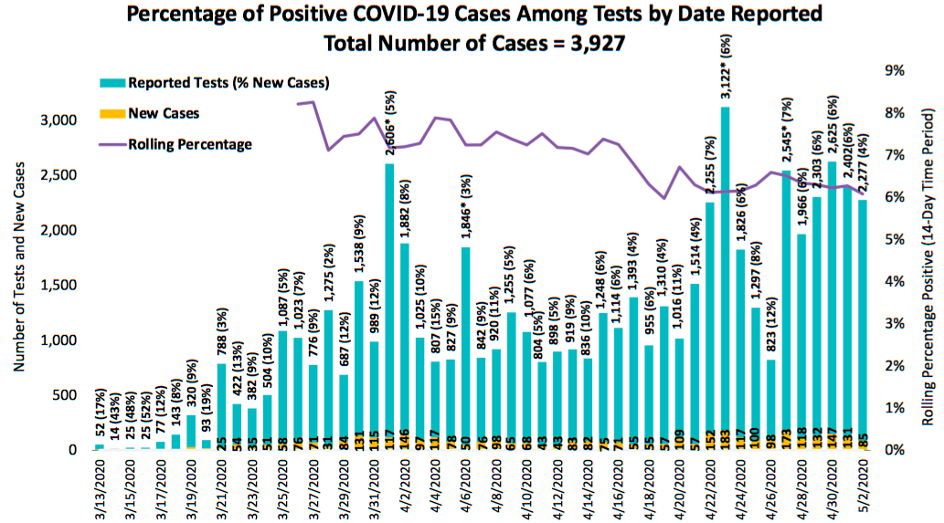
People have a lot to say about the current global pandemic. My nerd friends like to talk about numbers relating to the current global pandemic. The County health department, bless their hearts, continues to make me anxious about their ability to work with quantitative information when they produce graphs like this.
For a while, before the County was producing any graphs, I was posting a graph every day on my Instagram story with the log-linear plot of total cases in San Diego County as well as the doubling rate, assuming an exponential model.
Allow me to make a nerd aside here, but a lot of people are calculating doubling rates in ways that make me very, very nervous. They assume some sort of geometric progression, find the ratio for the past few days, maybe average those together, do a bit of witchcraft with the log of 2, and BAM! they have a doubling rate.
If you are assuming that the number of cases is following an exponential model (which, around here isn’t the best assumption; piecewise linear is a better bet), do keep in mind that the case count is count data, which means that your model should assume a Poisson distribution and not a Gaussian distribution. So if you are using software like R, you would fit a generalized linear model with something like
mymodel <- glm(mydata$cases ~ mydata$days, family=poisson(link="log")). And then you could calculate your doubling rate withlog(2)/mymodel$coefficients[2]and the confidence interval withlog(2)/(confint(mymodelg2)[2,2]andlog(2)/(confint(mymodelg2)[2,1]. For example, based on the data from the past week, we would say that the case doubling rate for San Diego County is 18.7 days, with a 95% confidence interval of 16.01 - 22.46 days. If you don’t report a confidence interval, you are just making stuff up.But now the County publishes graphs! And some of them are bad graphs. BUT GET THIS, the County also publishes an API. (Spoiler alert: Not the best API.)
One of my friends got me a server so that I can make stuff with the County’s data. My test-rate graph does not yet do the 14-day moving windows that theirs does, but I did spend a fair amount of this afternoon making graphs instead of using water.
And tomorrow I will go back to “work” (at home) writing software to display data on webpages. Of course the work data is displayed on work webpages using all sorts of very sophisticated technologies, so it takes far more time (and tears) to make them.
-
Tales from the BugMaster
Details changed substantially for student privacy.
- 22:55 Dear Mr. Euclid I don’t think we covered this in class. Sincerely ImaginaryPikachu314. PIKA PIKA!
- 22:57 Part 2 of 2: Mr. Euclid what does relatively prime mean?
- 23:01 Dear Mr. Euclid, this problem is so hard! Can you help me? PIKA PIKA PIKA CHU!
- 23:02 Also why is it called Report Error these are not errors the ones that I am writing right now
- 23:03 Never mind I think I figured the problem out.
- 23:07 Why isn’t it accepting my right answer. Can you help me now? I need to go to sleep soon. PIKA CHU!
Two posts in two days? Don’t get used to it.
-
The Tyranny of Vegetables
Wow, I have gotten really bad at blogging.
I had such high hopes for this whole quarantine thing. I could write blog posts! I could work on some ambitious knitting projects! I could make another quilt! So many things to do!
Instead, I am chopping vegetables.
I am one of the people who is lucky enough to be able to work from home, and I am still earning the same salary that I was when I was working from work. The truly lucky people are the ones who are only “working” in scare quotes from home as part of a don’t ask, don’t tell sort of arrangement in which they are being paid to watch Netflix. I know a few of these people, and they are trying to get a book deal based on their very Instagrammable quarantine lives.
But I am working from home the same number of hours per week as I used to work from work. Sure, it is more convenient because I do not need to drive to Rancho Bernardo every day. Not driving to Rancho Bernardo also makes it more reasonable for me to do server maintenance on a Sunday because I’m fine with logging in for half an hour to push some buttons, but driving 20 miles (each way) to push buttons is much less appealing.
Do you know what I am doing with the hour a day that I save by not having to commute? I am chopping vegetables. I am cooking. And this in not some sort of Instagrammable cooking. This is the life that I have been forced into now that I no longer have access to unlimited office snacks and the taco shop on the corner. Sure, sure the taco shop does take-out and even has a drive-thru, but this taco shop used to have a “B” rating from the health department, and this is not the right time to be going to restaurants like that.
It has been years since I’ve cooked. Sure, I have gotten pretty good at ricemaker + Instant Pot, but mostly it has been snacks and restaurants.
I’ve been doing my grocery shopping via online delivery, and I have no idea how much of anything to order. Is the produce measured in pounds? Or by each? It turns out that $2 worth of bananas is A LOT of bananas. I bought some arbitrary number of turnips, and that ended up being a lot of turnips. In honor of the fact that I had so many turnips and that the grocery delivery service decided to substitute a block of cheddar cheese for the tofu that was not in stock, today I conjured the side dish of “cheese turnips.”
You didn’t come here for the recipe for cheese turnips, I hope. Because if that were the case you might complain angrily that the recipe is at the end of the blog post and you had to scroll down to see it.
Cheese Turnips Peel some turnips and cut them into chunks. Boil the chunks until they start to turn sort of translucent and are getting soft. Drain. Mash up the turnip chunks and add some butter and A LOT of shredded cheddar cheese. Stir until evenly blended. Regret that you didn’t think to saute some garlic to make garlicky cheese turnips.
-
Bad Graphs
Lots of people these days are making graphs about how the number of cases of COVID-19 is growing in a particular location. Since the data is messy, people are having a hard time extrapolating into the future from these graphs. Well, epidemiologists and other experts probably know what they are doing, but the rest of us are just squinting at the graphs and trying to figure out what “flattening the curve” should look like.
There is a physicist with a viral YouTube video in which he promotes a new way of graphing this data. Can we still say “viral” in this situation or has that become insensitive? Normally I despise all videos on the internet (for various reasons), but I watched this one because my smart friends seemed to like it – and to like the graph that the physicist was hawking.
I’m not linking to his video because I am petty.
I’m also too lazy to draw some graphs of my own, so this is going to be all math and words. Sorry not sorry.
In any event, the physicist is drawing a graph that he says doesn’t include time but is actually a parametric graph in which time is the parameter. The \(x\)-axis of his graph is the log of the number of cases, and the \(y\)-axis of his graph is the log of the number of new cases. This is already sufficiently obfuscated that most people are not actually understanding the underlying ideas. Even those in quantitative fields might not realize that this use of a log-log plot means that there are some shenanigans going on and that we should be wary of this graph.
Now, he admits that he’s not actually graphing the log of the number of new cases on the \(y\)-axis because that was too noisy. He is graphing the log of the average number of new cases per day, averaged over the past week. Those of us in the math biz should recognize “the number of new cases per day” as “the rate of change of the number of cases,” which is to say “the derivative.”
So to recap, we have some function \(f(t)\) that represents the number of cases on day \(t\), and we are drawing a parametric curve of the form \((x(t), y(t))\) where \(x(t) = \log(f(t))\) and \(y(t) = \log(f’(t))\).
Since we’re in the exponential growth part of the pandemic, we can approximate \(f(t) = Ce^{kt}\). We also have \(f’(t) = Cke^{kt}\). So plugging these into the physicist’s parametric equations, we are plotting points of the form \[(\log(Ce^{kt}), \log(Cke^{kt})),\] which simplifies to \[(\log(C) + kt, \log(C) + \log(k) + kt).\] We can eliminate the parameter \(t\), which makes our plot the much more comprehensible \(y = x + \log(k)\).
This is why the plots from so many countries ended up on the same line: Because if the underlying model is exponential, this log-log plot is going to give you a line of slope 1 and with intercept \(\log(k)\). But based on the scale of the plot (and the noise in the data), you are not going to see much difference in the value of \(\log(k)\) over the sorts of time scales that we are looking at.
In plain language, this physicist’s graph can not give us any information about whether we are flattening the curve. This graph can make it really clear once we’re no longer following an exponential model, but it does not make it easy to see how the parameters of an exponential model change over time.
subscribe via RSS