Making Graphs on the Internet
I told you not to expect more posts on a regular basis.
I’m full of excuses here. I couldn’t do any chores today because the water went out in the apartment for most of the day. You might think, “Wasn’t there a very disruptive plumbing project for pretty much the entire month of February so that this would not happen any more?” Yes, yes there was. I do not know the full extent of the situation, but it seems to be that there are a lot of parts of plumbing systems and a lot of things that can go wrong with them. This used to be a bad neighborhood before it was a trendy neighborhood, and this building was built during the “bad” era.
And I could not work on my hobbies because I can not motivate myself to knit a gauge swatch. I’m hoping to make a sweater with a picture of my cat on it. It would be so cool to have a sweater with a picture of my cat! But it might turn out badly in so many ways, and I am just not prepared for that sort of disappointment.
Also, it is forecast to be summer degrees outside at some point this week or next week. Probably not the right time to be wearing a cat sweater. And do I have enough yarn to make this sweater? I mean, I have many, many, many miles of yarn, but do I have enough yarn that is all the same type and all the same color to make something? Well, if the thing is purple, maybe.
And for someone who never goes outside, I have quite a surplus of homemade masks. Including two made with purple unicorn fabric.
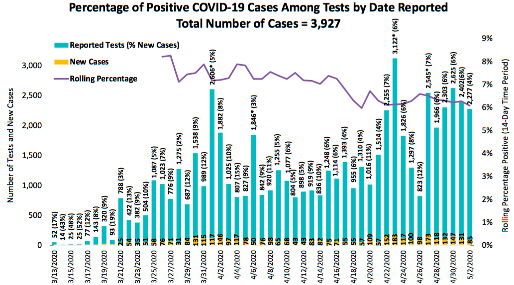
People have a lot to say about the current global pandemic. My nerd friends like to talk about numbers relating to the current global pandemic. The County health department, bless their hearts, continues to make me anxious about their ability to work with quantitative information when they produce graphs like this.
For a while, before the County was producing any graphs, I was posting a graph every day on my Instagram story with the log-linear plot of total cases in San Diego County as well as the doubling rate, assuming an exponential model.
Allow me to make a nerd aside here, but a lot of people are calculating doubling rates in ways that make me very, very nervous. They assume some sort of geometric progression, find the ratio for the past few days, maybe average those together, do a bit of witchcraft with the log of 2, and BAM! they have a doubling rate.
If you are assuming that the number of cases is following an exponential model (which,
around here isn’t the best assumption; piecewise linear is a better bet), do keep in mind
that the case count is count data, which means that your model should assume a Poisson
distribution and not a Gaussian distribution. So if you are using software like R, you
would fit a generalized linear model with something like
mymodel <- glm(mydata$cases ~ mydata$days, family=poisson(link="log")). And then you
could calculate your doubling rate with log(2)/mymodel$coefficients[2] and the
confidence interval with log(2)/(confint(mymodelg2)[2,2] and
log(2)/(confint(mymodelg2)[2,1]. For example, based on the data from the past week,
we would say that the case doubling rate for San Diego County is 18.7 days, with a 95%
confidence interval of 16.01 - 22.46 days. If you don’t report a confidence interval,
you are just making stuff up.
But now the County publishes graphs! And some of them are bad graphs. BUT GET THIS, the County also publishes an API. (Spoiler alert: Not the best API.)
One of my friends got me a server so that I can make stuff with the County’s data. My test-rate graph does not yet do the 14-day moving windows that theirs does, but I did spend a fair amount of this afternoon making graphs instead of using water.
And tomorrow I will go back to “work” (at home) writing software to display data on webpages. Of course the work data is displayed on work webpages using all sorts of very sophisticated technologies, so it takes far more time (and tears) to make them.