More Disappointments with DataCamp
So many of my nerd friends like DataCamp that I really, really, really want to like it more than I do. Some might say that I am an overly negative person, but, really, I just have high standards. I got lured in by a sponsored Facebook post to try out their phyllotaxis project, and they let me down again. On the bright side, the poor quality of the free content has me convinced that I am never going to pay them a cent for their paid content.
I will summarize the phyllotaxis project for you so that you don’t need to register an account.
- Phyllotaxis and sunflowers are really awesome looking!
- There is this thing called the Golden Angle, and it equals \((3 - \sqrt{5})\pi\).
- Want to know more about it? Read the Wikipedia!
- We will grade you on fiddly nonsense, like removing the axis tick marks and all that crap that you need to google every time you do it. Also, you can’t just do it by using an existing theme because that doesn’t match with what our auto-grader expects.
I had never heard of the Golden Angle before. If you divide a circle into two arcs where one is one Golden Ratioth of the other (I can “-th” any number to make it the denominator of a fraction), then the central angle of the minor arc is the Golden Angle. This was not mentioned in the DataCamp course; I had to see the Wikipedia.
The rest of the DataCamp course was, as I mentioned, a bunch of antfucking about tick lines and colors and opacity. There was nothing at all in the guide about figuring out why things work.
Of note: If the angle in the code is any integer factor of \(\pi\), then you will
just get points aligned along rays, and it will not be particularly interesting.
However, some choices, such as \(\pi\) will give you cool-looking artifacts,
probably because of issues relating to precision and rounding. Any other angle,
even something boring like 1 (radian), will give you a spiral; it just won’t be a
phyllotaxic spiral.
Nothing in the code helped me understand how the spiral was built. Which points went where!?
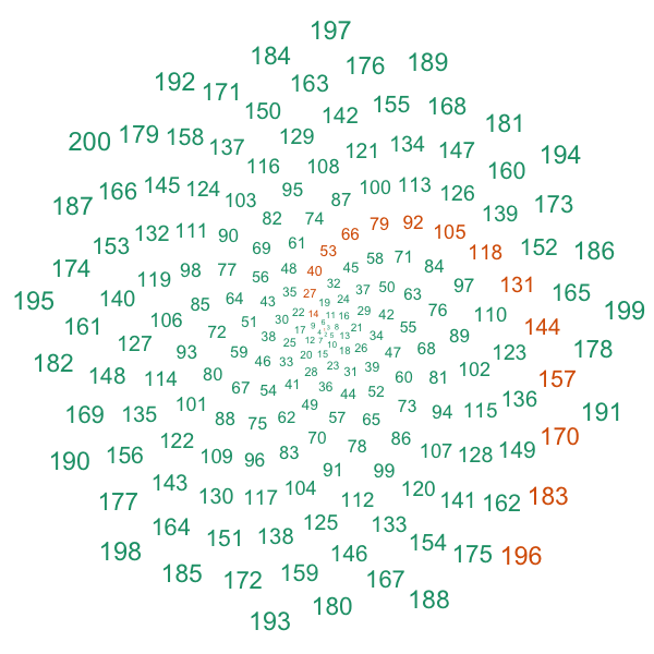
So here is my improved version. Specifically, I replaced the points with their indices; smaller numbers were plotted first. Also, I made the points that were congruent to 1 modulo 13 a different color. You could go modulo any Fibonacci number and see something cool.
library(ggplot2)
theme_set(theme_bw())

# Inspired by the DataCamp phyllotaxis project

points <- 200

# Defining the Golden Angle
angle <- pi*(3 - sqrt(5))

index <- 1:points
t <- index * angle
phyllo <- data.frame(index, t)

# Make a scatter plot of points in a spiral
p <- ggplot(phyllo) + geom_text(aes(x=t*cos(t), y=t*sin(t), label=index, size=t, color=(index %% 13 == 1))) + theme_void() + theme(legend.position="none") + scale_color_manual(values = c("#1b9e77", "#d95f02"))

ggsave(filename="~/Desktop/phyllo.png", plot=p, width=6, height=6, units="in", dpi=100)